
I’ve heard a lot of people talking about how many lives have been saved by Obamacare, and how many lives will be lost if it is repealed. So I decided to look at the mortality statistics for the United States before and after passage of the Affordable Care Act. The data for 2009-2014 is taken from the Age-Adjusted Death Rate table on page 22 of this PDF and the data for 2015 comes from the Key Findings on page 1 of this PDF. (I originally started writing this post before the 2015 data came in, and had to update the data before publishing.)
The ACA was passed in 2009 and took effect in 2010 (although parts were not phased in until 2014).
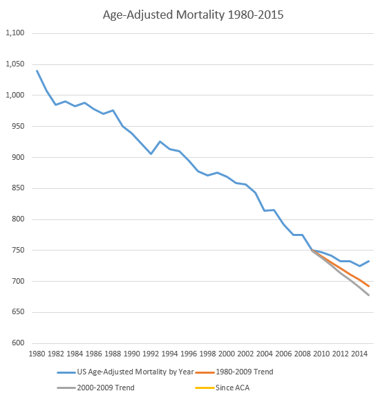
My chart starts in 1980 because that’s when the table starts doing year-by-year data rather than decade by decade data. It ends with the 2015 data because those are the latest available.
I included a couple of trend lines after 2009, to show what the age-adjusted death rate would be if it had continued to change at the average rate from 1980-2009 (30 years) or the average rate from 2000-2009 (10 years).
If the ACA were saving a significant number of lives, one would expect the death rate to decline faster than those trend lines.
Instead, as you can see from the graph, the decline in the death rate slowed after the ACA passed. If the death rate had continued to decline at the same rate as the previous decade, then about 175,000 fewer people would have died in 2015 (based on a U.S. population of 319 million in 2015).
Now, of course, I am not asserting that Obamacare is the cause of the slowing decline in mortality rate. Correlation does not imply causation. There are a lot of things that can affect the death rate, and it’s quite possible that other factors — factors that by pure coincidence became more significant after Obamacare passed — have overwhelmed the impact of Obamacare. But if Obamacare is, on average, saving lives, that’s not showing up in the basic mortality statistics.
Continue reading at the original source →